
In this digital era, having a strong online presence is very crucial to the success of a business. Your online presence, through your website, helps you in your marketing campaigns, your 24/7 customer service, helps you build relationship with your clients, and most importantly it helps increase brand recognition. But sadly, despite its benefits, there are still business owners who still do not realize the importance of the website to their business.
A recent survey showed that 55% of small-to-medium sized businesses still don’t have a website. That is an astonishing number nowadays. We live in an internet world, and many still don’t see the benefits of having a website, or even so, don’t have the time to commit to it.
To help you see and understand the importance of a website to you and your business, here are some of the benefits of having one :
Benefits of Having a Website For Your Business
- Online Visibility
- Your 24/7 and 365 Days Salesperson
- Most Economical Form of Advertising
- Your Advertising Tool
- Show Your Business Authenticity
The internet has opened up a whole new world of marketing that didn’t exist before. A website is the most efficient and low-cost marketing tool you could have today, it helps you be heard and seen in this digital era. Without a website for your business, nobody knows your business exists when they search you online or any services and products related to your business. It’s almost similar to not choose to be listed in the phonebook in the olden days.
Even when the office hours is over, your website still runs 24/7 without any supervision or need to lock it up. When your salesperson is not available, your website will be the one promoting your business to potential customers anytime, day or night. By having a website, you can always be there for your customers.
If you are considering to spend some marketing dollars? A website should be an initial one-time investment that can cost you less than your daily latte to upkeep. Considering the cost of a print ad from a newspaper and mailers, having a website delivers a favorable cost to benefit ratio and a great return on investment and the ability to update constantly it.
By updating your website to list new products or services, pricing, product availability, inventories, and answer frequently asked questions by customers. You can also collect current and potential customers close with targeted offers, coupons, and sales and promotion.
Since a lot of businesses have a website nowadays and people are accustomed to checking everything online for a product or services, having no website for your business means your business is not legitimate, tricky, not legal, or even unreliable. But by having a professional website you can easily build credibility with your target market. You can provide them the ultimate proof that you are, in fact, legitimate, legal and reliable.
WEBSITE DESIGNER & DEVELOPER IN CEBU
Go2designlab is a Digital Marketing Agency in Cebu, we specialize in Website Designing and Development and Search Engine Optimization. We build different types of websites according to our client needs. Go2DesignLab caters to small businesses, individuals who wanted to express themselves such as having a blog, having an online store for their products or services, and to corporate clients who wanted to have an affordable online presence yet effective in presenting their messages to their website visitors.
WHY CHOOSE GO2DESIGNLAB
We have extensive experience in designing for small businesses, corporate, realtors, E-commerce online stores websites. We love to create a distinct design for your business, to get you noticed and to gain a better customer engagement, interaction and profitable outcome.
So if you have come to realize how important a website is for your business, then it’s time to build one. If you need help in building a professional website, Go2designlab is just around the corner and ready to help you be heard and seen online. You can reach us via phone call at (032) 410-6528 / (032) 415-5536. or you may email us at [email protected].
We are always ready to help become visible to the online world.
We can help. Contact us for We Can Build a Reliable Website For You.
We are your Online Presence and Web Marketing Solution.
Affordable and Reliable and We will listen to all Needs.
www.go2designlab.com
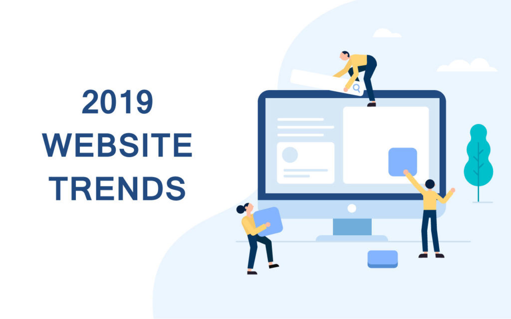
With continuously evolving trends and tech, there has never been a more exciting time to be a designer. 2019 will be all about delivering on user experience: web design trends will prioritize speed and mobile design, eye-catching simple designs with asymmetrical layouts, immersive video backgrounds, and more.
Here are some of the dominating web trend predictions for 2019, but this is by no means the last word on creative innovation.
Bright and vibrant colors
Color is one of the most exciting tools for a designer to communicate a brand’s message. It not only has the power to draw attention but also has a direct influence on emotions and actions. Making such a strong impact, it makes sense that color choices should also be carefully considered for a great website design.
Bright and vibrant colors are excellent for attracting attention and highlighting call-to-actions. Too many bright colors can be distracting to the eye and actually decrease a viewer’s ability to remember information which is why it’s vital to find the right balance. It enhances all the right details and harnesses the audience’s reactions without feeling overwhelming when used correctly.
Even more video content
There is no surprise when I say that video headers are becoming popular. You might think with speed being such a huge factor this year that videos would bog down a site too much, but, interestingly, video backgrounds have been shown to increase conversions.
You don’t need an explainer video to tell you that video content for the web is nothing new. Video not only diversifies the page but caters to an on-the-go audience who don’t have the time to scan through a lot of text.
Videos encourage people to stick around and spend more time on your website. And, that’s why the video has become a strategic web design element
Responsive Design
Any website design having flexibility among all the screen resolutions and the devices are the most important approach among all the website trends. With mobile sites taking priority away from desktop sites, it’s no wonder that mobile first design has become a trend.
Responsive web design adapts to the size and shape of the device screen used to view your site. Well-executed responsive design provides a great user experience for everyone who visits your website. It creates a great user experience and is cost-effective which is also recommended by Google. It is very easy to manage as the website has one URL and HTML, regardless of the device. As it makes it easier for users to share and interact with the link provided.
Chatbots evolve
Chatbots have been up-and-coming for a while now but will finally move into the spotlight in 2019. This is mostly due to the advancements in AI and machine learning, making them more intelligent and efficient.
Over the last several years, interacting and communicating with bots has become more and more normal. Bots, or chatbots, are becoming increasingly common on websites and micro-interactions across digital media. It’s likely that you spoke with one the last time you called your mobile service provider.
Chatbots and machine learning will continue to enhance user interactions with websites, especially as autoresponder functionality inherent in most chatbots can seamlessly interact with users for you and provide excellent customer service upfront. This starts your relationship with potential customers off on the right foot while simultaneously gathering info for your sales team before they begin actually interacting with the prospect.
Minimalism
Perhaps one of the most classic and timeless web design trends, minimalism is often the go-to aesthetic of choice. The fewer elements and content on a website, the less your audience will have to think. If a website is designed in the right way, it will show the user exactly what she is looking for.
Because of outside influence, we are often asked to add more than we’d like to a design, and our instincts tend to guide our layout into symmetrical grids. In design though, less is often more and asymmetry can be powerful and eye-catching. This is precisely why minimalistic asymmetrical layouts are among the most difficult design styles to execute.
Whether through white space, contrast or clear typography, minimalistic designs allow users to naturally focus on the right message without getting distracted by other things. The key is to understand what those important elements are first and then hone in on the details.
Final Thoughts
Keeping up with trends can be a great way to keep your finger on the pulse of where businesses are heading. Your website is a critical component of your brand, and as your brand and marketing strategy evolves, your site should as well.
There are still many surprises in store and plenty of time to contribute your own ingenuity to this list of trends. As much as we’d like to imagine that we know what 2019 will bring, it is ultimately up to you. Whatever you choose, remember that there are many millions of websites online. The only way to stand out is to create a website that’s unique and different.
]]>
CSS plays a major role in web development. It gives a website its look and layout. What most people don’t know about CSS is that it’s one web development assets that the browser will look for. The browser is blocked from rendering the page until CSS is downloaded and parsed, it must be as lean as possible. Here are five tips to help you get there.
While working with CSS, there are certain do’s and don’ts that should be kept in mind. This helps in getting the efficient results from CSS.
NAMING CONVENTION
Don’t describe style in selector names
Do not use descriptive class names like ‘ green’, ‘orangeDot’ etc. Instead go with class names that describe the purpose of the element or content and not its appearance.
Don’t
.blue-text { … }
Do
.highlighted-text { … }
Selectors should describe purpose, not style.
Keep specificity as low as possible without using tag selectors
Specificity can be a pain in the ass when it starts skyrocketing. Try to keep it as low as possible.
Don’t
.content #intro .icon { … }
Do
.intro-icon { … }
Talking about specificity, NEVER use id selectors and !important.
Do not use ID SELECTORS
ID selectors are fine, valid and perfect for styling unique parts of pages. But you can only use one ID per page. Here’s some of the reason why you should not use ID selectors.
1. Class specificity is lower than ID specificity
IDs have a much higher specificity than classes. A class on its own can’t overwrite styles belonging to an ID. To “beat” the ID, you would need either more IDs or to use !important. (Never use !important unless it is your last resort).
2. Classes can be reused.
IDs should be unique on a page ( but then some browsers didn’t follow this strictly). This means that if you use ID instead of class, you won’t be able to reuse the style attached to it within the same page. Classes, however, can appear on several HTML elements on the same page.
3. An element can have several classes, but only one ID
You can add many classes to a HTML element, for example
, but not ID.
Make all selectors referring to a page/component start with the same word.
Name your class related to which page they are used. This way, given a class name, you will automatically know which file to look for.
For example;
Don’t
 .front-page-title { … }
.intro-home { … }
.home-text { … }
Do
.home-title { … }
.home-intro { … }
.home-text { … }
Don’t reset styles you just wrote
Don’t
.menu-item {
  margin-top: 5px;
}
.menu-item:first-child {
  margin-top: 0;
}
Do
.menu-item:not(:first-child) {
  margin-top: 5px;
}
The :not() pseudo-class has existed for years now and it’s well supported by all browsers, so there is no reason to write two rulesets, one creating the styles and the next one resetting them for a specific subset of elements when you could achieve the same with only one ruleset.
Use shorthand properties
You can shorten your code by using shorthand. For elements like padding, margin, font and some others, you can combine styles in one line. For example,
Don’t
font-size: 1.5rem;
line-height: 1.618;
font-family: "Arial", "Helvetica", sans-serif;
That’s a lot of CSS! Let’s tidy that up:
Do:
font: 1.5rem/1.618 "Arial", "Helvetica", sans-serif;
The font shorthand property condenses several declarations into a handy one-liner that takes up much less space.
This also applies in margin;
margin: 8px 7px 0px 5px; // top, right, bottom, and left values, respectively.
The padding property works the same way.
Cross Browser Compatibility
USE RGB format instead of Hex format
When you’re building a website, you simply must realize that it will be rendered by different browsers ( from niche ones like Konqueror to giants, such as Firefox, Chrome or IE), on different operating platforms and on different devices. As a web developer, it is your responsibility to create a unique experience that works equally great on all possible devices and systems.
For example:
A background-color with decreased opacity in hex format. This will work well in Chrome but not in Microsoft Edge and Internet Explorer. To solve this, convert it to RGB (RGBA if the opacity has been reduced).

Learn how to hasten page rendering by cutting the excess from your site’s CSS.
Render blocking css makes your website slow. Every one of your css files delays your page from rendering. The bigger your css, the longer the page takes to load. The more css files you have, the longer the page takes to load.
Do not use @import to call css
The CSS @import function allows a web developer to include external CSS files in a document. You can usually find it in the top lines of the css file looking like this:
@import url("cssfile.css");
The use of this method is not recommended because it adds to the time that it takes to load your css before your page can load.
Instead of calling that css file using the @import, include those css files from the html file by using the following code…
Make sure to replace “style.css” with the location and name of your file.
Remove Inline CSS files
Each css file your page uses adds additional time to your webpage loading by requiring an additional file to be called.
Because inline styles have the highest specificity in the cascade, they can overwrite things you didn’t intend them to. They also invalidate one of the most powerful aspects of CSS – the ability to style lots of web pages from one main CSS file to make future updates and style changes much easier to manage.
Use shallow selectors
Used consistently, shallow selectors can trim kilobytes off big style sheets. Take this selector:
Dont
nav ul li.nav-item
Instead, write it like this
Do
.nav-item
By doing so, the browser will render the elements targeted by shallow selectors faster. The browsers read selectors from right to left. The deeper the selectors are, the longer it takes for the browser to render and re-render the elements those selectors are applied to.
But sometimes you may need to additional specificity to overwrite a style from a framework like bootstrap. ]]>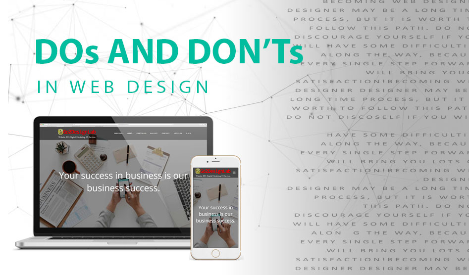
"Becoming web designer designer may be a long time process, but it is worth to follow this path. Do not discourage yourself if you will have some difficulties along the way, because every single step forward will bring you lots of satisfaction!" - THALION
The design is about the client and for the target audience, not for/about the designer, so resist the temptation do something just because you like the way it looks. So here’s the Dos and Don’ts in designing a website for the client and user satisfaction.
DON’Ts :
1.Don’t make users wait for content to load
A few extra seconds could have a huge impact on your website performance and ability to engage visitors and make sales. It’s an undeniable fact that high performing websites has higher SEO ranking which in result brings in more visitors and higher conversion rate. Website speed is one of factors that is used in many search engine in their ranking algorithm.
Avoid blank pages during loading. If its is really inevitable (which is impossible), consider displaying a loading indicator. This will entertain the user to make them wait till the page is fully loaded.
Optimize images. The higher resolution the image has, the larger its file size is. Large sizes images can slow down your website’s page speed. This hurts your users’ experience and, eventually, your search engine ranking. You can significantly reduce the loading time by optimizing your images.
2.Don’t let promotion steal the show.
Having too many ads on a page can easily overshadow the main content and make it harder for users to accomplish tasks. If you have too many ads on the page, they’ll all be competing to get your readers to look at them. Customers find ads very annoying and interruptive.
3.Don’t sacrifice usability for the sake of beauty.
No matter how beautiful a design is, it should never interfere with a user’s ability to navigate or interact with a website. The usability of the website (user-friendly) should your, as a web designer, top concern. Small things could have a huge impact on your design, start by making sure that the text are readable and use appropriate colors. Also, avoid using busy backgrounds behind content or insufficient color contrast.
4.Use blinking text and ads.
Blinking texts are so ‘90s;
When creating ads and animations, don’t even consider using flickering flashing effects. Content that flashes or flickers can trigger seizures in susceptible individuals, and is likely to be annoying or distracting for regular users.
5. Auto-play videos with sound.
Auto-play videos, music or sounds in the background irritate users. These elements should be used sparingly and only when appropriate and expected. Not only the users hate it but also the Google Algorithm. To avoid these auto-play videos, the latest update of Google Chrome now mutes annoying videos that auto-play with sound.
We’re done with the don’ts in web designing. Let’s now take a look at some of the dos.
DOs
1.GIF instead of Videos
GIFs in web design are so underrated.
GIFs are a great alternative to embedded videos because they use less bandwidth. Mobile users react better to GIFs than video because GIFs are faster.
You can use a GIF to demonstrate what a tool does or how to interact with a web page. A GIF is easier and faster than reading a long-winded text paragraph of explanation.
2.Ask your Client
Never forget to involve your client in web designing.
Know their Target Audience
The answer can give you an idea on how to come up with a design that would connect to your clients audience. Design and develop your site with your users in mind, not just yourself. The users’ perspective may be very different from yours, which includes making your site user-friendly. Users should be able to move quickly and efficiently through your site. When information is buried and not easily localized, users tend to give up and feel frustrated with a brand.
3.Take content seriously.
Content is king. Probably 95 percent of information on the web is in the form of written language. Even if your site is beautifully designed, it’s no good without high-quality content. A good website has both great design and great content. It is your job as a designer to make sure that the design aids and complements the content.
Your visitors will appreciate high quality. Publish quality content and they will keep them coming back for more.
4.Make your website responsive.
Making your website mobile-friendly is no longer optional. The most important thing to consider in web designing is to ensure that no matter how the visitor sees your site, all vital information will be displayed correctly on different screen sizes be it on desktop, phone and tablet.
5.Let the White Space In.
Users want to have plenty of room to breathe and fully respond to a ‘less is more’ strategy. They don’t want to be overwhelmed with information, graphics, pops-up and an array of disoriented visuals. What they want is a simple, clear and well-designed page that gives them exact and important information and lets them know what they can do to learn more. Anything other than that is best replaced with a nice chunk of white pixels.
White space, also called negative space, gives website elements room to “breathe” visually. If you group items too close together, you risk overwhelming visitors and convincing them to click away.
LET’S WRAP IT UP
A good designer is a keen observer. Start to observe people around you, the products you interact with and everything in your surroundings. And remember “Creativity is never rushed. There is no such thing as ‘INSTANT’ design only instant coffee ”
LET’S END IT WITH A TIP FROM : THALION (uxmisfit.com)
“Stay a beginner – Now you have a fresh mind, but when you will become an expert you will be tempted by your experience to follow only known paths. Do not ignore new, fresh or even weird things because of your knowledge. Having a beginners mind is one of the most important assets of every UX Designer.”
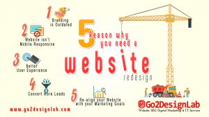
First, the business environment continues changing. The company's website is the connection of lines. So it needs to continue to redesign their website. Small businesses evolve, adapt, and change to match a wealth of influences and market forces. Your website, at its very least, is an extension of your business. It should be integral to growth and change. It is central to market goals, and combine this with technological advances and user expectations.
What is the purpose to redesign the website?
The marketing strategies of other companies can reflect changes in results. The company's website doesn’t need a full website redesign to adjust the marketing strategy, it is a good choice if business people check the website if it is still aligned with the newest marketing plans.
Can create a better user experience.
The user experience is a discipline of a design that is becoming increasingly crucial in website success. It deals with the experience of a visitor has when navigating through your website and how it caught their intentions.
A site that is carelessly handling to navigate, has a slow load time, and it can give the unnecessary complexity that can turn off the visitors and can cost you a valuable lead.
Your website needs a mobile responsive.
Today’s generation there’s multi-screen, a company need to make the website be a response to the multi-screen. If your website is not mobile optimized, you can miss the valuable leads. If you can’t see your own website on your mobile device also the customer can’t see so they choose to go another site.
You can get the result that you want.
If your website is functional and user-friendly you can get an awesome feedback. You should redesign your website in order to get other valuable leads and customers. Examine your site conversion rates because visitors can be customers also can provide you a clear idea what problem needs to improve.
Your branding need to up-to-date.
Your company’s branding needs a consistent with your website. When you updating your website you should include your content and important keywords. You need a landing page that it looks like your company.
Can have an effective website strategy.
If you are already done a redesign, you learned a fair amount about what does not work well in the design process. Not only having one website redesign take an interactive approach. Having an approach it can help you to use the information you gathered about what works to improve your website accordingly. You can’t even notice the small changes on the sites you visited. The major brands have the entire teams to performing every little detail. You can make sure your every change you make has a clear purpose and solve the problems.
You want a better content strategy.
Having a content on your website can improve your customer retention to SEO and with the continuing changes to the search engines, you should be smart to put a fantastic content plan. The quality content is useless if your visitors difficult to find it. If you are planning to make big changes to your content, web redesign may be a wise choice. In that way, your content is easy to find and your leads will grow and grow.
Your other competitors changed their site.
Your competitors changed their site to improve their rankings and can push you down in searches. Maintaining your edge in search not only the goal, you should need to be near on the top of SERPs to defeat your competitors. Analyze what SEO that you should adjust to being on the top of searches.
How much does website redesign cost?
Website design costs vary according to a wide range of factors, including the level of redesign required. In most instances, it is actually more cost-effective to start again. Nonetheless, however much you invest in your website redesign is exactly what – an investment. Websites pay for themselves. A good website should bring a valuable return on investment.
Your other third-party tool is outdated.
If your website is like other company, you should fix the third-party tools that can improve your functionality. If your tools are not up-to-date you should update them. The best way is to make your tools is up-to-date because visitors can be a customer.
Your website doesn’t give value to your customer.
Potential visitor visit only once in your website, you should make things that helpful or useful to them, they will always return to your website. In additional to your current products or services, the regularly-updated in mobile web design, and video content can keep your visitors coming back for more.
Your website doesn’t work.
This is one of the most common mistake creating a website, you have probably unbalanced on your website this can be a not working normally. Your website needs to be a user-friendly because this is one of the problems that are not effective and you can’t realize that they are making your site less effective.
Optimize the buyer’s journey on your website.
Your website is an important thing to your sales. It works around to the clock to create a positive idea for the visitors. That is why it is important to design your website to the buyer. The user journey takes into account to your buyer’s journey and can keep them moving through your sales channel.
Your website hasn’t the same with your business.
Other reason that you need a website is that it has not kept up with changes in your business. The outdated information can difficult to understand in your customer and can cause problems for your team.
The website is mobile friendly.
The Internet usage statistics shared by googling some of the smartphone users used search to find a local business or job. The mobile web usage has been growing by year after year. The internet users prefer to use the mobile devices to browse the web.
Your social media shares don’t look great.
When you share your site on social media, the links need to look good. The link’s thumbnail should be eye-catching. The title of the link and the description should also have a useful thing that gives readers an idea of what you shared all about.
The visitors quickly leave the site.
Some website works best when the users visit multiple pages, also you want people to read and share your articles. If you have an e-commerce website, you want people to browse your products and services you offer. If this is the case of your website, the users should be sticking around for a few minutes.
There are a few studies you can use to figure out if users leave your site too quickly:
- Bounce Rate. Your bounce rate is the number of bounces divided by the number of sessions on your site. Keep in mind that if users leave your site quickly but you still meet your business goals, then you don’t have anything to worry about.
- Pages/Session. This is the average number of pages that users view per session. The higher this number, the more pages your average user views when looking at your site.
- Behavior Flow. This can give you a better idea how too greatly users go through to your website, especially your metrics is above to your needs.
The competitor’s website can make you jealous.
You do not need to redesign your website every time like your competitor's changes. It is important to record your business does not live inside a filter bubble, if your website is not in the quality of your competitors, you are the most likely losing sales than another website.
- Competitor’s SEO in better. Maintaining the edge in search is not your only goal, if you are not near the top of the searches results, you need to adjust the strategy of your website to compete.
- Your competitor has better content and function. If you spend the time to your competitor’s website and you meet your goals is far from the better you should find an agency that can build you a website that can be more eye-catching to the users.
- Competitor’s design is better. You can visit your competitor’s website and you feel jealous, you can probably create a design that can compete with your competitors.
Some of the content doesn’t display properly.
Your images might not be displayed right, some of these things can be fixed in a simple update. It is possible that your website is running on scripts that are no longer supported. If your website is designed for several years, this can’t be compatible with the newer browsers and devices. If you unsure what is the cause of the problems on your website, you can contact us to figure it out and can help you to get more upgraded designs that customer needed.
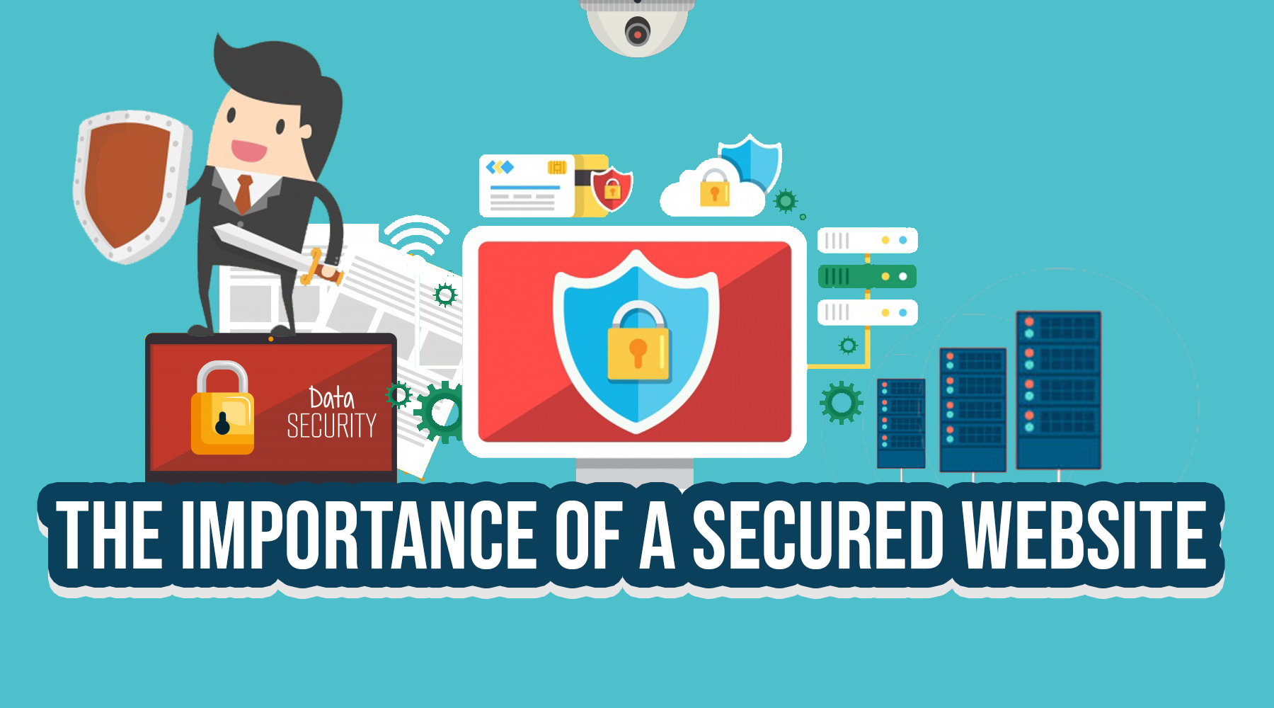
Your website isn’t secure.
There is a website that is easy to attacks, such as those content management systems, also those e-commerce websites that send or receive payments online. In case of an attack, the data of customer can be stolen, and your website could be hostage form anonymous people. You can see the unwanted ads and links that start appearing on your website.
Users can’t find what they’re looking for.
When the potential customer visits your site, they could be able to figure out what to do. If users looking for the specific information, they can find what they are looking for in a few minutes. You should need your website easier to navigate. If you get many calls and emails about the information you can start successful business leaders.
The design isn’t flexible enough
A mistake many businesses make when designing a website is designing it for today’s needs only. A website should be adaptable. Content strategy changes over time, and if your site isn’t flexible enough to meet new needs, such as additional pages, then you will need to begin planning a website redesign.
Your Content Management System is past its time
The whole purpose of a CMS is to make your website management easier. In reality, many website owners find they have to navigate quirks in their CMS in the same way you have a knack for locking your own front door. Without realizing it, CMS can become harder and harder to use over time. By redesigning your website you’ll get back to ease of use.
How many times should I redesign my website?
If you’re asking that question, the answer is almost certainly now. Generally, website redesign should be considered everyone to three years, depending on the nature of your site, business, and technology advances in that time. However, in reality, it should be as soon as it isn’t meeting yours, or your customer’s needs.
If you have a web developer on-board with a maintenance contract, you will also need to liaise with them regarding when a redesign might be necessary.
How does my website compare to my competitors?
As we’ve already said, it’s easy for your potential customers to go elsewhere if they don’t quickly get what they need from your website. 75% of people rate the credibility of a company on the design of their website, so you need yours to be ahead of your competitors.

Also known as Web Presence is a collection of publicly accessible interlinked Web pages that can share a single domain name. It can also be created and maintained by an individual, group, business or organization to serve a variety of purposes. All in all, publicly accessible websites constitute the World Wide Web.
We’re now living in this modern era where people are on the internet to gather information. What better way to gain customers for your business? Well, it is obviously through a Website. And why do you think people visit a website? It is not just for gathering information but also to do business. Information is critical if you’re in the business world where it contains information about what you can do and offer for them, in return for money. If you don’t have a website for your business then you are losing a number of great opportunities for your business. Having a website for your business these days is really crucial. Why? Because it can use to accomplish many different marketing strategies to help your business grow. Well, you see it has a wider reach than any other form of advertising. The great thing about the internet is that it doesn’t really matter what’s the size of your company. Therefore there’s no reason for your company to get your site to rank in Google ahead of large multinational competitors out there.
No Website Means Losing Business
Business without a Website is clearly out of opportunities. Opportunities that will make your business grow, recognized, and be considered as a business professional. Opportunities that will help the customers to identify who and what is your business and if they want to spend millions of money with you. But on the other hand, let’s say your business has a website but a bad website it is, then is it better to have no website. Why? Because upon seeing your brand’s bad website, customers will think that you’re not capable of giving them a professional output. Since it literally makes your business look bad. Which is why a bad website is far worse than no website. But let’s be clear, both are bad for your business. Build a website that is attractive to your potential customers.
Reasons Why Your Business Needs a Website
- Your Customers Expect It
- Your Brand Will Show Up In Google Search Results
- Better Communication With Your Customers
- To Showcase Your Business
Customers expect you to have a website with your brand. Why? Because most customers tend to do business through online of its benefits of ease of accessibility. And believe that your business is capable of building a website which gives them the trust and loyalty to your business. Frankly, if you don’t have a website for your business, then it is most likely that your customers will look elsewhere.
Considering that half of the percent of the consumers perform online research before making a purchase or perhaps making business. Which is why keywords and SEO are very crucial to your website because consumers believed whoever comes first in the search results is worth to do business with. Thereby increasing the chances of potential customers.
Communicate the customers to inform them your newest product, offers, promotions, events or any happening regarding your business. Which will give them an important part of your business?
Share to the world of what your business is capable of. Upon seeing what you have come up together with the content of your website, it helps the customer to trust and consider your brand as a professional to do business with it.
Advantages Of Having a Website For Your Business
- Brings Convenient To Your Customers
- Credibility Of Your Business
- Business Marketing
Having a website can be pretty convenient for your customers. With just the click of the button, a business can be made. Imagine, if your customer will be driving out looking for stores that are available to shop at a far distance. Would it be more convenient for the customer to just sit down in the comfort of their own home and to just look online for products of what they want? Obviously yes, unless the customer aimlessly driving around. So the potential for your business to have a presence online.
Most people actually will search on the internet for a positive review of your product, perhaps to check the credibility first. Basically, if you give the customer what they want and make them satisfy, is more likely your business will spread dramatically. Because there are some people tend to trust a business after they have done business, as it can continuously serve consumers online and increase your credibility as a business owner.
A study shows that all online marketing strategies have been proven to be effective. It allows you to market your business through online. One advantage of marketing your business through online is that it attracts new customers to do business with you.
It is imperative to have a website in the business world. Mind that the more professional your website is, the more advantages you can gain.
We are your Online Presence and Web Marketing Solution.
Affordable and Reliable and We will listen to all Needs.
www.go2designlab.com


What Does It Take To Have An Effective Online Presence?
It starts with an effective website that grabs everyone's attention with a clean and sharp design, uncluttered homepage, engrossing pictures and clear and concise text description. A social media can accompany your website so that it could find your prospective clients quicker and a post about your services or a product can be shared instantaneously to a much wider audience. The need to be listed in a multiple search engine's business listing locally can also boost traffic to your website.
A Search Engine Optimization service might be useful if you wanted for your business to rank while being searched by a potential customer. All these will be needed to have an effective online presence and if you are planning for your business to stay in the game while cutting your cost to market your company then it's time to go digital. Go2DesignLab Corporation will be your guide to achieving an effective online marketing for your business but for a fraction of a cost. Website designs from an informative to corporate to have your online store (e-commerce), we can also provide a website maintenance support team, I.T. Technical Staff, Online Marketing Services (Social Media and Search Engine Marketing), and whenever you wanted for your company to be ranked then we are your S.E.O. service company.
What Is The Importance Of Online Presence?
In this age of generation we live in, it is really an absolute essential to have an online presence for your business. Whether it’s a website, or an e-commerce platform, a social media page, it is a major opportunity to have your business online. Customers and even potential customers are expecting to your brand online, it would be a great disappointment and you could lose out an opportunity to increase your customer base and to showcase your business.
Effective Ways To Build an Online Presence
The world is changing constantly so it is really important for a business to not remain static. Which is why having an online presence is essential to the business world to create a strong presence for your brand.
- Set your goals
- Be Consistent with Create Value
- Get SEO
- Track Your Visibility
- Always Be Patient
The next best thing for the growth of your brand is by having an effective online presence. Believe me, it is really helpful for your brand. But in order to have an online presence, how do you intend to start it? So set your goals. Set your aims, objectives, write your plan and make it plain. Carefully strategize on how you intend to achieve your goals. Choose your target, whoever will they be. Evey goal is attainable with a boost of confidence along the way. Build it to a level where it can help your overall business goals.
Always provide a consistent value first with the best value there is. If you prioritize this then it would be a great help for you and your brand to attain credibility and then, slowly become an authority in your field in which it carves a niche for your brand. I tell you this is very important for your online growth and visibility.
Your website should be the central place where your audience can learn more about your brand and what you have to offer and how people can contact you for your services. So be solid on your website. However, this won’t have any impact if your webpage is drowned amidst a sea of content on the web. And this is where SEO comes in. SEO techniques can literally take your website from zero to ranking on the front page of the search results. So it is really important to understand the true meaning of SEO and what’s it capability and so that you can channel your efforts towards creating a sellable and relevant content to have an effective online presence.
How do you know whether all this hard work is paying off? Keep track. Don’t just sit in front of your screen day in and out and expect that your plan is falling into place just because you’re following the process. Keep track. Always check your work and analyze every little thing that could help to increase your online visibility. Use some techniques, gather information and use it to your advantage. Which will help you to whenever to change your strategy or keep you satisfied that you seem to be doing the right thing.
It very important to be patient all the times, wait for the opportunity and let it come to you. It may sound contradictory. But having a strong presence on social media is imminent so it is really important to be patient enough to see what will happen. Since there is no hard and fast rule to these things, don’t be afraid to play around with your methods, in the beginning, to see what works best for you and your audience. Over time, you will learn what works for you and what doesn’t.
Try to follow these tips and your business will be more visible online. With so many things to do online now, make your online presence effective.
We can help. Contact us for your Social Marketing Needs.
We are your Online Presence and Web Marketing Solution.
Affordable and Reliable and We will listen to all Needs.
www.go2designlab.com